Details
Tools:
Clickfunnels | Figma | Thrivecart
Date:
2025
"She helped me make $36,000 within seven days and absolutely crushed it."
Background
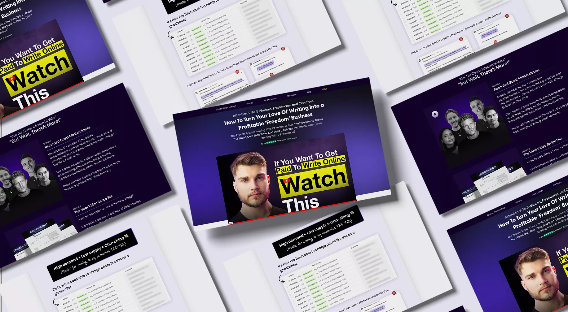
Dakota Robertson teaches ghostwriting and personal branding. He’s built a large, highly engaged audience through sharp, honest writing and a very clear point of view.
Our work started around the launch of a low-ticket community. That later expanded into a high-ticket coaching page and a free course used as a lead magnet. Over time, this project grew into shaping several key entry points into his ecosystem.
The audience already trusted him. The ideas were strong. The copy was doing a lot of the heavy lifting.
The challenge
The main challenge was the style of copy.
This was classic long-form direct response. A page that scrolls for a while. Story-driven, opinionated, and very dense. In this kind of work, the copy is the foundation.
That meant design templates were basically useless. This wasn’t about plugging content into a layout. The design had to respond to the copy, not the other way around.
There was also the risk of over-designing. Dakota’s writing is engaging, funny, and sharp. I remember laughing while reading parts of it as I was designing. The goal was to keep people reading, not distract them or slow them down.

The approach
We started with moodboarding and alignment.
I got clear on how Dakota wanted the page to feel and what kind of energy he wanted to bring across. He already had some branding done, but we treated it as a flexible foundation rather than a strict system.
From there, I focused on structure and flow. Using hierarchy, spacing, and rhythm to support long-form reading. Adding illustrations, graphics, and images where they helped maintain momentum or future-pace the reader, without pulling attention away from the copy.
Social proof played an important role. Testimonials, screenshots, and real outcomes were woven in to reinforce credibility and keep trust high as people scrolled.
As we built, I also flagged areas where clarity was missing. In a few places, I asked Dakota to expand or clarify certain points so the page could do its job properly. Those additions made a noticeable difference to how the offer landed.
Everything was built in ClickFunnels, which is a fairly traditional funnel builder. Even so, the final build surprised him. It didn’t feel like a standard template page. It felt considered, intentional, and very “him”.


Results
The community launch generated $36,000 in five days.
Beyond that, the ecosystem now has:
a high-ticket coaching page that brings in qualified leads
a free course that works as a strong entry point
landing pages that reflect Dakota’s personality and authority
The pages convert, but they also add to the brand. They don’t feel generic or interchangeable.
A number of people reached out saying they’d never connected with a landing page like that before. Some of them later became clients themselves.

Personal insight
This project was a good reminder that great copy deserves great support.
When the writing is strong, the role of design isn’t to impress. It’s to stay out of the way while quietly guiding attention and keeping people engaged.
Working with Dakota reinforced how important personality is in conversion. You don’t need to sand it down to make something sell. You need to protect it, structure it, and let it do its job.

Convert Impact | 2026